ムラーノガラスやヴェネチアンビーズなどヨーロピアンコスチュームジュエリーを取り扱うchisaの旗艦店の看板の設計を担当。
路地奥にある店舗へのアプローチにユーザーの視線がどのように流れるかを、メインの検討項目に据え、複数のアイキャッチとなる看板を配置して検討した。袖看板はシンプルな直方体のフォルムを避け、ゆるやかにリズムの生まれる表情となるよう側面を一段セットバックさせている。
伝統的な手法から生まれる洗練されたコレクションを集めたchisaらしく、モダンでクラシックなひとつのジュエリーをイメージしたデザインを目指した。
We were in charge of designing the signage for the flagship store of chisa, which deals in European costume jewelry such as Murano glass and Venetian beads.
The main consideration was how the user’s eye would flow to the approach to the store, which is located at the end of an alley, and multiple eye-catching signs were placed for consideration. The sleeve sign avoided a simple rectangular form and was set back one step on its side to create a gently rhythmic expression.
The design was intended to evoke the image of a modern and classic piece of jewelry, in keeping with chisa’s collection of refined collections born from traditional methods.
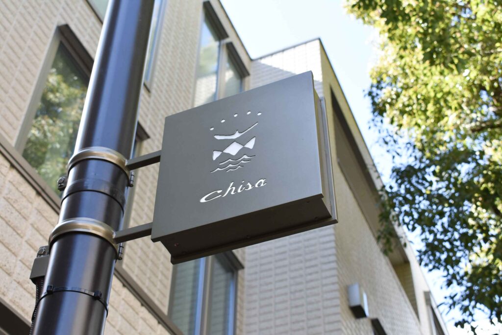
Signboard @ chisa
サイズ : 幅300mm 高さ300mm 奥行き80mm
素材 : 溶融亜鉛メッキ鋼板 t=1.6mm / 真鍮古美色風焼付三分ツヤ仕上げ
その他スタンド看板二種を設計。
製作:無相創
2016.
関連アイテム